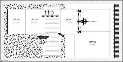
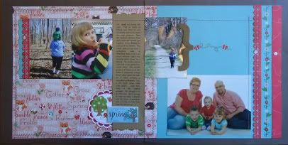
And here is my interpretation. I used one of my favourite lines from Imaginisce, "Twitterpated" and I was glad to be able to use a whole sheet of the adorable animal paper included in the collection.
My little sister became engaged to her boyfriend at the beginning of May. They took a little vacation to NYC and Wayne popped the question in Central Park. Now she has a lovely diamnond ring and I am getting another brother-in-law!!

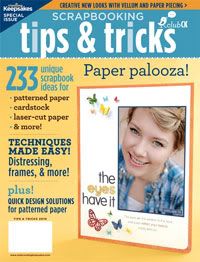
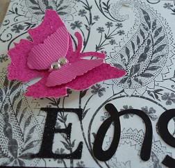
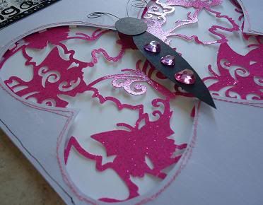
I recently bought a copy of this magazine. While creating this layout, I challenged myself to use at least 2 techniques found in the mag. The first technique I tried was the use of laser-cut paper through a peek-a-boo opening. I even stitched around the opening just like they suggested. The second technique I tried was to create a funky photo border using a row of scalloped half-circles. I really like how this border brings the photo into prominence even though there is a large hot pink butterfly in the opposite corner!!
Thanks for stopping by!! ( Hey look, Meghan!! You're on the blog!!)


Beautiful Layouts... and where ever did you find that magazine? I have been looking for it for a while now...
ReplyDeleteyay! Nice work B! Looks beautiful! XOXXOO
ReplyDelete