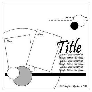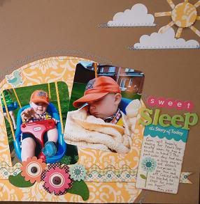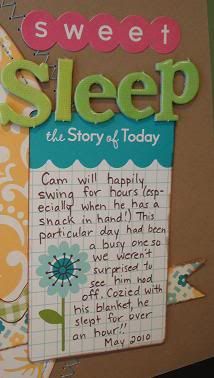
I liked how most of the elements were placed together on one side. I knew I had the perfect pics of Camden on the swing with which to create the layout. So I hopped to it, using "Fly a Kite" papers from October Afternoon.


Thanks for looking! Please leave a comment.... : )


Dad's card looks great! And you know you don't have to worry about him logging onto this site to get a sneak peek! ;-) Beautiful work on Camdan's page too!
ReplyDelete