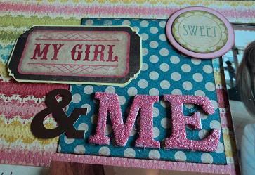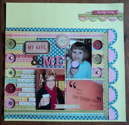
My Challenge was to create a project that had "recessed" elements. I do a lot of "pop-dotting" to RAISE parts of my pages, but I had never really tried the opposite.
Here is my example:

Do you see the recessed areas? The cut-out circles create another dimension - that way, the shadows created become another design element.
Do you like?
By the way, I am on the Design Team again. Busy with this month's kit. I can't wait to post my new creations!


what a unique challenge. I love the layout you created to go with it.
ReplyDelete